Styling for the camera is an acquired talent. Luckily, the talent is easy to master once you understand the “Camera’s Eye.” The camera does not see what you see. Instead, the camera has a very narrow perception of the world.
Firstly, the camera completely lacks the 3rd dimension – Depth!
Depth in visual images, be it stills (photos) videos, paintings, etc… are an illusion. Yes, an illusion. The only exception is 3D visuals, which is the whole purpose for 3D. Our brain is smart enough (conditioned, really) to reconstruct how deep an object is in a picture from its height and length, the lighting shrouding the object and the environment the object is in. The brain uses these “clues” to create a hodge-podge pseudo 3rd dimension. And, it does a pretty poor job of it.
Now that we have completely insulted our brain, what does all this have to do with styling?
Well, lots!
Volume, Texture, body and movement are the core elements of the design of a style. And, just incase you are wondering, depth (or the lack thereof) also affects color perception!
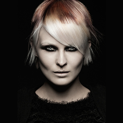
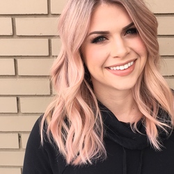
Ever wonder why the hour you spent creating long waves and curls into a model’s hair looks flat and weighted dow? Yup, lack of depth. When you look at the style you have just created, with both eyes, your brain creates depth by comparing the visual from each eye. The difference between both eyes is perceived as depth. The camera only has one “eye” leaving you with insufficient information to perceive depth, hence the image looks flat, compressed – dimension-less.
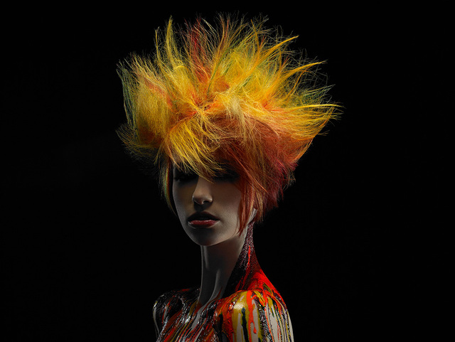
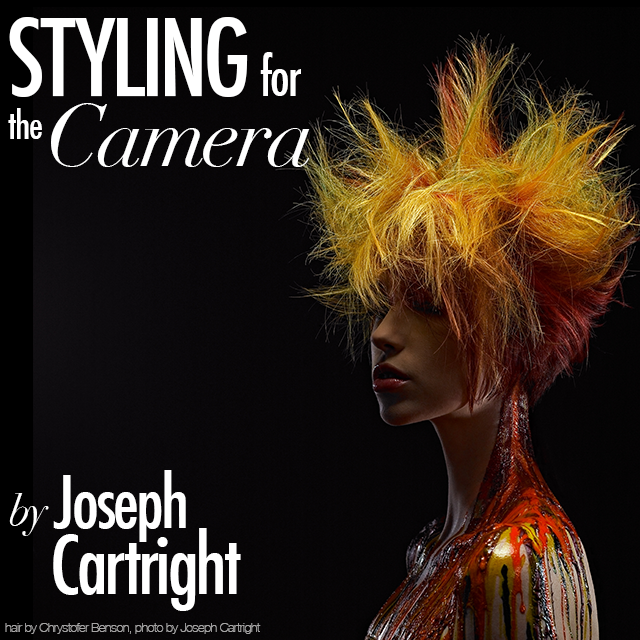
hair by Chrystofer Benson, photo by Joseph Cartright
What can you do about it?
Well, some!
Depth in the real world is greatly enhanced by lighting, or lack of lighting – meaning shadows. Shadows play a huge roll in the perception of depth. This is especially true in still images. Shadows, and I don’t mean dark/black shadows but shadow transitions, gives the brain a sense of scale allowing you to determine how deep something should be – and then the brain makes it up. So cool!
A well lit image, and by well I don’t mean a lot of light, I mean properly lit, can make an image look 3 dimensional. This is why beauty/hair images that are created outdoors show very little detail and dimension of the style. In order to show detail and dimension, the lighting needs to be very controlled and deliberated and usually requires many specially placed lights. Creating images outdoors is exactly the opposite – it's one light – the sun, and it's everywhere, which crushes details and dimension.
Secondly, the camera compresses anything that is directly in front and in line with the lens, and behind the object, in this case – the model's head and hair. If you place a finger directly in front of one eye at a slight angle and shut your other eye, it's impossible for you to determine how long your finger is. But… if there was a shadow, or a change in lighting running down your finger, you would have a “perceived” idea of how long your finger is.
In short, understanding that the camera does not capture depth, you should collaborate with the photographer on overcoming the effect. This is most effectively controlled by great lighting and by creating and exaggerating the style to overcompensate for the loss of depth.
With a little practice, you should have no problem creating images with great dimension.
This is the first of a multipart series on Styling for the Camera, from Joseph Cartright.
If you are interested in developing or improving upon your styling skills for editorial photoshoots, enroll in Visionary Icon, a 2 day workshop, April 26-27th 2015, taught by Joseph Cartright and Chrystofer Benson, that walks you through the entire creative process of doing a photoshoot, from concept to print.
Already have some editorial work under your belt? Enter the Visionary Icon contest and upload your imagery for a chance to win a free spot in the class and pick up some new techniques from the best! Only 2 days left to enter!
